FiveThirtyEight.com

It’s not often then I visit a website, especially on mobile, which really turns my head. But that’s exactly what happened when I visited https://fivethirtyeight.com/.

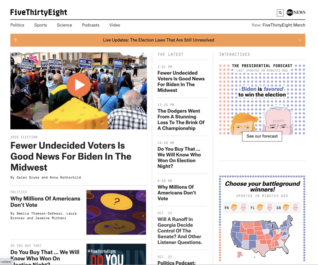
Fig 1 – https://fivethirtyeight.com/ desktop
Above is the desktop view but, as I say, I first visited it on my mobile:

Fig. 2 – https://fivethirtyeight.com/ mobile
So, what impressed me here?
My positive impression was instant so I need to try and unpick that to understand the reasoning behind it.
It seemed to load quickly
Note: when I tested this later, with performance tools, the site was not particularly performant – which goes to show that humans are not good judges of decent website performance – but only aware of poor performance. However, there was obviously something about the design or experience which reflected well with me.
Function & Purpose
The function/purpose operation of the site seemed immediately seemed clear to me.
I wasn’t swamped with choices. And what choices there were present were presented to me in a clear manner (I admit this is not a complex site).
Fonts
The use of different fonts (families/sizes/colour) for various information areas really helped me quickly grasp the information layout of the page.
Fig 2 does not do that justice, but if you scroll on your phone, you’ll see what I mean. I’m an old git now at 50 but even the smaller fonts were crisp and caused no issues for my glasses.
Search & Menu
A prominent search, and a prominent menu button (not a hamburger icon).
Don’t make me think
A clear, prominent, ‘live update area’. This box succinctly communicated to me what that area was for, and that I could click on it to find out more.
Beautiful illustration
I don’t know if this illustration is bespoke to the site; perhaps they have a fantastic in-house team. Either way, it really leapt out to me. Now not all websites can afford bespoke content like that, but when you’ve got it – flaunt it.
Pop-ups (1)
Pop-ups and other distractions really seem to be the bane of websites at the moment: they have their place but the maxim of ‘less is more‘ applies.
Pop-ups (2)
I didn’t see a cookie banner on the site. Now either that means the website has gone for a very minimal script/cookie approach (ditching Google Analytics, Facebook Pixel etc, and perhaps going for something more privacy focussed like Fathom instead) or perhaps they’ve not yet fully addressed CCPA/GDPR etc – I’ve not dug at length on the site but it certainly looked like some sort of self-hosted analytics solutions they were using.
Either way, it feels like the future of websites, a crisper user experience, involving fewer pop-ups etc & fewer things shouting at us. If this means dialling back on the privacy challenging services a website uses then great – as that means we can lessen the impact of pop-ups like a cookie banner.
Call to actions
Call to actions are the buttons or the things that you want visitors to your website to do.
With this site I was not swamped with call to actions; perhaps this plays into the Harvard study which showed that a stall selling 6 types of jam outperformed the stall selling 24 types – too much choice causes paralysis – again, less is more.
Though I would say, if it were me, I might be tempted to try a little harder to get people to sign up to the newsletter – yes there is a banner on the homepage, but it was waaaay down. I then wondered if it were more prominent on individual article pages – using the logic that when someone had read an article & invested more time, they would have established enough trust with the website to be ready to part with their personal information. I didn’t see a difference though.
Perhaps their design choice here is subtler – perhaps they are assuming (from the fairly high brow nature of the content) that their audience is already informed and very web savvy; and more than capable of taking the next steps (if they so wish).
The counter-argument here is that “yes, but if the call to action was bigger they would get a greater conversion!” – but perhaps that just isn’t FiveThirtyEight’s mindset. Perhaps the design mentality here was clean and simple – let the content do the work & the audience will follow.
End Thoughts
Overall the design feels very minimal; perhaps this is a personal choice but this really works for me as I think it allows all the key content to ‘breath’ and not be fighting for attention. Compare that to the frustration summed up in this tweet from Simon Brew
Loads website.
Accepts cookies.
Closes down ad covering part of screen.
Stops auto-playing video.
No, I don't want you to send alerts to my home screen
No, you don't need to know my location.
No, I don't want your newsletter.
Closes website without reading the article I came for.— Simon Brew (@simonbrew) October 26, 2020
What do you think?
Joel
